

This guide is part of our in-depth performance engineering series on WordPress speed optimization. For the complete high-level architecture, explore our foundational 3-step framework.
You start reading an article on your phone. You see an interesting link and move your thumb to tap it. Just as your finger contacts the screen, an unannounced banner pops in at the top. The entire page shifts downward by two inches. You tap the wrong link. You get redirected to an unrelated advertisement. That sudden jump is visual instability. And it infuriates users. Google created Cumulative Layout Shift to measure this exact frustration. If your pages jump, your conversions sink. It is that simple.
To fix Cumulative Layout Shift WordPress issues below Google’s strict 0.1 threshold, you must preserve visual stability by reserving physical dimensions for every dynamic asset before browser rendering begins. Cumulative Layout Shift (CLS) is a Core Web Vitals metric evaluating the sum total of unexpected layout reflows across an entire page session. Google calculates CLS by multiplying an impact fraction (the percentage of viewport area disrupted) by a distance fraction (how far elements moved). Unlike raw load metrics such as TTFB or LCP, layout shift represents structural design negligence rather than server limitations. Common triggers include missing aspect ratio attributes on images, late-loading web fonts triggering font-swap reflows, unreserved dynamic advertising containers, and un-contained third-party widgets. Stabilizing your DOM requires reserving intrinsic media geometry, aligning fallback fonts with CSS size-adjust, isolating dynamic embeds, and configuring containment properties so page layouts remain completely immovable during asset hydration.
Having studied systems information at university, I’ve spent over a decade analyzing software architecture, browser rendering engines, and DOM reflow cycles. Across more than 3,000 custom web platforms, high-concurrency Node.js event loops, Laravel enterprise APIs, and WordPress builds engineered at our development company since 2015, layout instability is one of the easiest issues to prevent yet the most frequently botched. Browsers calculate layout geometry in strict mathematical pipelines. When you violate those geometric rules, the browser discards its work and starts over. It’s an unnecessary waste of CPU cycles. Let’s dissect the exact mechanics behind visual reflows. We’ll stabilize your WordPress site to lock in a true 0.00 CLS score.
Table of Contents
1. Google CLS Scoring Thresholds and CrUX 75th Percentile Evaluation
Google evaluates visual stability through the Chrome User Experience Report (CrUX). This dataset collects real-world telemetry from millions of actual Android and desktop Chrome users. Synthetic lab audits in Lighthouse offer a quick snapshot. But field data from CrUX dictates your ranking performance in Google Search. That’s what counts. Plain and simple.
Because Google aggregates all mobile and desktop user visits over a rolling twenty-eight-day collection window and evaluates your performance strictly at the seventy-fifth percentile mark across the entire Chromium telemetry network, a single unstable layout component on high-traffic templates will quickly drag your entire domain down. That means seventy-five percent of your recorded page sessions must achieve an untainted Good rating. If twenty-six percent of your mobile visitors experience jarring element reflows while scrolling through content, your URL immediately fails Core Web Vitals. No exceptions. Dead stop. Zero tolerance.
| CLS Rating Tier | Score Threshold (75th Percentile) | Real User Experience Impact | Search Engine Impact |
|---|---|---|---|
| Good (Green) | ≤ 0.10 | Total visual stability. Reading is comfortable and zero accidental clicks happen. | Full Core Web Vitals ranking qualification. |
| Needs Improvement (Orange) | 0.11 to 0.25 | Noticeable content reflows occur during late font downloads or lazy loading. | Marginal performance score; potential ranking drag. |
| Poor (Red) | > 0.25 | Violent jumps. Elements bounce while users attempt to read or interact with links. | Fails Core Web Vitals; mobile ranking demotion. |
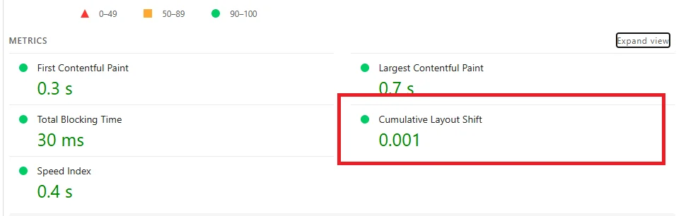
Notice how narrow the Good threshold is. A score of 0.10 gives you almost zero margin for error. A single shifting hero element or an unreserved banner can instantly push your score past 0.15. In modern web engineering, our benchmark is zero. If an element exists on the page, its physical footprint must be known before the browser paints the first pixel. We don’t guess geometry. We declare it. Every time.
2. The Mathematical Anatomy of a Layout Shift (Impact × Distance)
To resolve layout instability, you must understand how Chromium tracks shifts under the hood. In early iterations of Lighthouse, layout shifts were summed indefinitely. If a user stayed on a page for twenty minutes, every tiny shift stacked up. Google revised this in 2021 by introducing session windows. It’s a much fairer model.
A session window is a burst of shifts that lasts up to 5 seconds, with a maximum 1-second gap between individual shifts. The single session window with the highest cumulative shift score represents the page CLS value. Each layout shift within that window is calculated through two geometric fractions:
Layout Shift Score = Impact Fraction × Distance FractionWhen an unexpected layout shift occurs during an active session window, Chromium calculates the Impact Fraction by computing the union of the visible element’s original bounding box and its translated coordinates relative to the total viewport area, ensuring that any visual disruption spanning both desktop monitors and mobile touchscreens is rigorously penalized. If an unstable header spans 100% of screen width and occupies 50% of viewport height, and shifts down by 20%, the combined affected area is 70% of the viewport. That yields an Impact Fraction of 0.70. It adds up fast. Pixels jump.
The Distance Fraction measures the maximum distance the unstable element traveled relative to the viewport’s largest dimension (height or width). In our example, the element moved downward by 20% of the viewport height. That yields a Distance Fraction of 0.20.
Now calculate the shift score: 0.70 multiplied by 0.20 equals 0.14. That single jump immediately fails the Google Good threshold of 0.10. Total freeze. One minor banner insertion pushed a clean page into the failing tier. This proves why visual reflows can’t be ignored. Ever.
3. Fix 1: Reserving Intrinsic Image and Video Aspect Ratios
Missing dimensions on media elements remain the number one cause of high CLS in WordPress themes. Historically, responsive web design encouraged developers to write CSS rules like img { max-width: 100%; height: auto; } while omitting HTML width and height attributes. That was a serious mistake. Don’t do that. Never.
When responsive WordPress themes omit intrinsic width and height attributes from media elements, the browser layout engine is entirely unable to allocate vertical display space during initial HTML parsing, forcing the browser to completely recompute the document flow and push existing paragraphs downward the precise instant image binaries download across the network. Consequently, the browser allocates a zero-pixel height box. When the image file finishes streaming, the browser recalculates the document layout. The container expands from 0px to 400px, pushing all downstream text, headings, and buttons downward. Pixels jump everywhere. It’s a mess.
Modern browsers calculate intrinsic aspect ratios automatically when both width and height attributes are present in the HTML. The browser reads the ratio before downloading a single byte of media data. Here’s the exact markup standard required for every WordPress image:
<!-- Zero-CLS Image Tag with Explicit Dimensions and CSS Aspect-Ratio -->
<img src="hero-banner.webp"
     width="1200"
     height="675"
     alt="High Performance Architecture"
     loading="lazy"
     decoding="async"
     style="aspect-ratio: 1200 / 675; width: 100%; height: auto;">
What about responsive images with varying crops across screen breakpoints? Use modern CSS aspect-ratio rules inside media queries. If your hero image displays at a 16:9 ratio on desktop and switches to 4:3 on mobile smartphones, declare the aspect ratio explicitly in your stylesheet:
/* Responsive Aspect Ratio Reservation */
.post-featured-media {
  width: 100%;
  aspect-ratio: 16 / 9;
  background-color: #f1f5f9; /* Subtle placeholder prevents flash */
}

@media (max-width: 768px) {
  .post-featured-media {
    aspect-ratio: 4 / 3;
  }
}
Notice the background placeholder color. Adding a subtle neutral background color gives users visual feedback that content is loading while locking the container height. When the image renders, not a single pixel shifts. Zero reflow. If you want a complete breakdown of image compression formats and responsive srcset attributes, read our guide on WordPress image optimization.
4. Fix 2: Eliminating Web Font Swap Shifts (FOUT, FOIT, and size-adjust)
Web fonts are a silent killer of visual stability. Many site owners optimize images and think their layout is solid, yet their CrUX score remains above 0.15. The culprit is almost always font swapping. This phenomenon manifests in two common forms:
- FOIT (Flash of Invisible Text): The browser hides text until the custom web font finishes downloading. Once loaded, text suddenly appears. This delays text visibility and frustrates readers.
- FOUT (Flash of Unstyled Text): The browser renders text immediately using a local fallback system font (such as Arial or Georgia). When the custom font downloads, the browser replaces the fallback font.
To avoid FOIT, performance tools recommend setting font-display: swap. But there’s a major catch. System fonts and custom web fonts have different typographic geometry. For example, Arial and Inter don’t share the same glyph widths, baseline alignments, or line heights. When Inter replaces Arial, text paragraphs wrap differently. Three lines of text suddenly expand into four lines. That reflow pushes every subsequent section down the screen. Pixels jump. Users get angry. Your CLS score spikes.
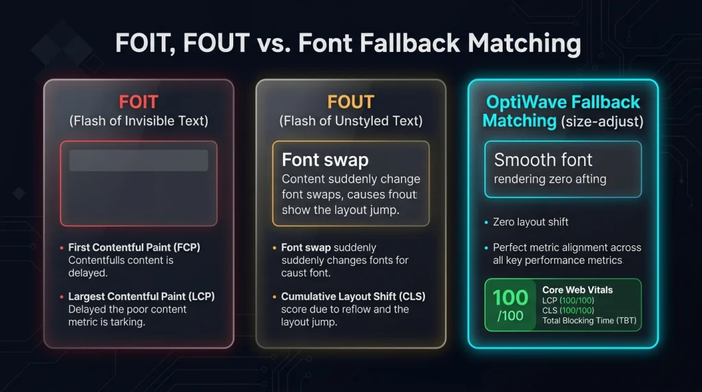
How do you solve this? You use CSS font metric overrides. Modern browsers support four powerful properties in @font-face declarations: size-adjust, ascent-override, descent-override, and line-gap-override. These properties let you morph the system fallback font to match the exact physical proportions of your web font.
/* Primary Web Font Declaration */
@font-face {
  font-family: 'Inter';
  src: url('/fonts/inter-latin.woff2') format('woff2');
  font-weight: 400;
  font-style: normal;
  font-display: swap;
}

/* Calibrated Fallback Font to Eliminate Layout Shift */
@font-face {
  font-family: 'Inter-Fallback';
  src: local('Arial');
  size-adjust: 107.5%;
  ascent-override: 90%;
  descent-override: 22.5%;
  line-gap-override: 0%;
}

/* Assign the Fallback Stack in CSS */
body {
  font-family: 'Inter', 'Inter-Fallback', sans-serif;
}
When the browser renders the initial text with Arial using the calibrated fallback, each letter occupies the exact same horizontal width and vertical height as Inter. When Inter finishes downloading and swaps in, nothing reflows. Line breaks stay identical. The layout shift score is zero. That’s precision engineering. Plain and simple.
5. Fix 3: Stabilizing Dynamically Injected Ads, Iframes, and Notification Banners
Monetized blogs and publishing platforms depend on programmatic advertising networks such as Google AdSense, Mediavine, or Raptive. These ad tags operate asynchronously. They execute JavaScript that queries an ad auction, downloads a creative, and injects a new DOM element into the page content. We see this all the time.
If the ad container has no predefined height, it starts at 0px. When the winning bid returns 1.5 seconds later, a 250px tall banner appears. The article text leaps down half a screen while the user is mid-sentence. That triggers massive layout shifts. To eliminate this penalty, always reserve the maximum slot height in your CSS beforehand:
/* Reserved Ad Container with Zero CLS */
.ad-slot-wrapper {
  min-height: 280px;
  width: 100%;
  max-width: 336px;
  margin: 1.5rem auto;
  display: flex;
  align-items: center;
  justify-content: center;
  background-color: #f8fafc;
  border: 1px dashed #cbd5e1;
}
What happens if no ad creative is returned by the auction? You should collapse the slot gracefully. But never collapse it immediately if doing so would cause a reverse layout shift. Instead, place un-filled placeholders or configure your ad provider to only request ads within reserved bounds. It’s much safer.
Cookie consent banners and promotional top bars introduce identical shift problems. When a cookie popup pushes the entire <body> element down by 60px after JavaScript loads, every visible element moves. Never push the document body. Instead, position cookie notices and floating bars using position: fixed or position: sticky with an overlay z-index. Fixed elements float above document flow without moving underlying content. That solves it.
6. Fix 4: Eliminating FOUC and Late-Injected CSS Reflows
Flash of Unstyled Content (FOUC) occurs when a web page renders plain HTML before CSS stylesheets finish loading. Once the stylesheet loads, the browser applies styles to typography, margins, grids, and flexboxes all at once. Elements jump across the viewport violently. This is a common side effect of poorly configured speed plugins attempting to eliminate render-blocking CSS. We’ve cleaned up hundreds of these broken setups.
Many speed plugins defer the entire site stylesheet to achieve a perfect 100 on synthetic lab audits. That creates a catastrophic layout shift disaster for real users. If you defer CSS, you must inline the critical above-the-fold CSS directly into the HTML <head>. Here’s the architectural balance you need:
<head>
  <!-- Critical Above-the-Fold Layout Styles Inlined -->
  <style id="optiwave-critical-css">
    body{margin:0;font-family:system-ui,sans-serif}
    .site-header{height:72px;display:flex;align-items:center}
    .hero-container{min-height:500px;display:grid;grid-template-columns:1fr}
    @media(min-width:768px){.hero-container{grid-template-columns:1fr 1fr}}
  </style>

  <!-- Non-Critical Styles Loaded Asynchronously -->
  <link rel="preload" href="/style.css" as="style" onload="this.onload=null;this.rel='stylesheet'">
  <noscript><link rel="stylesheet" href="/style.css"></noscript>
</head>
By inlining the structural rules for your navigation bar, hero container, and grid wrappers, the browser paints the exact layout geometry immediately. When the full stylesheet loads later, it styles subtle colors and hover states without moving layout containers. For deep coverage on managing asset pipelines without breaking rendering, read our tutorial on how to eliminate render-blocking resources and our guide on how to remove unused CSS in WordPress.
7. Fix 5: Preventing Layout Shifts in Elementor, Divi, and GreenShift Blocks
Visual page builders like Elementor, Divi, and WPBakery introduce layout shift vulnerabilities through dynamic JavaScript recalculations and entrance animations. When an Elementor page initializes, JavaScript scripts read section heights, calculate column offsets, and manipulate flexbox properties on the client side. That triggers immediate DOM reflows. It’s slow and clunky.
Even worse are entrance animations on above-the-fold hero sections. When you configure a heading to “Fade In Down” or a button to “Bounce Up”, the builder initially renders the element with opacity: 0 or translates its coordinate space with CSS transforms. If the script executing the animation is delayed by browser main thread tasks, the page renders empty, then violently pops into place seconds later. Google records this entire animation sequence as a layout shift.
To stabilize page builders and modern block plugins like GreenShift, follow these three non-negotiable rules:
- Disable Above-the-Fold Entrance Animations: Never apply fade-in, slide, or zoom animations to your hero section, main navigation, or primary heading. Reserve animations exclusively for content located below the fold.
- Define Explicit CSS Grid Row Heights: When using multi-column grid layouts in GreenShift or Gutenberg, declare explicit column fractions in CSS rather than relying on JavaScript auto-fitting scripts.
- Switch to Pure CSS Flexbox Containers: In Elementor, activate the Flexbox Container experiment. Legacy section/column markup requires nested wrapper divs that trigger excessive reflow recalculations. Containers render with native browser CSS engine speed.
When building with modern block editors, ensure that custom block wrappers don’t inject unexpected inline padding or margins after component hydration. Clean native HTML is inherently stable. Keep it that way.
8. Fix 6: Safe Lazy Rendering with content-visibility and contain-intrinsic-size
The CSS content-visibility: auto property is one of the most effective modern performance optimizations. It tells the browser rendering engine to skip layout, styling, and paint calculations for offscreen containers until the user scrolls near them. On heavy pages with extensive comment threads or long product grids, this cuts rendering time dramatically. It’s a fantastic feature when used properly.
However, there’s a dangerous trap. If you apply content-visibility: auto without pairing it with contain-intrinsic-size, the browser assumes the offscreen element height is zero. As the visitor scrolls down, the element enters the viewport proximity and suddenly expands to its real height. The browser scrollbar jumps erratically, and surrounding content shifts. This destroys your CLS score during scrolling.
To implement lazy rendering safely with zero layout shift, always specify estimated container heights using contain-intrinsic-size with the auto keyword:
/* Safe Offscreen Container Containment */
.post-comments-area {
  content-visibility: auto;
  contain-intrinsic-size: auto 650px;
}

.related-articles-grid {
  content-visibility: auto;
  contain-intrinsic-size: auto 420px;
}
The auto keyword is crucial. It instructs the browser to remember the element’s rendered height once it has been rendered once. If the user scrolls past the container and then scrolls back up, the browser preserves the exact recorded pixel height rather than reverting to the estimate. This guarantees zero layout shift in both scroll directions. Fast and stable.
9. Real-Time Shift Attribution: Diagnosing CLS with DevTools and PerformanceObserver
To fix layout shifts, you must find which elements are shifting and what triggered the move. You can’t fix what you can’t see. Chrome DevTools provides two primary diagnostic tools:
- Performance Panel Experience Lane: Open DevTools, record a page reload, and examine the Experience track. Every layout shift is marked with a red indicator. Clicking a shift record reveals its exact score, cumulative total, and shifting DOM node in the summary panel.
- Rendering Tab Layout Shift Regions: Open the DevTools drawer, select the Rendering tab, and check “Layout Shift Regions”. As you scroll and interact with the page, any shifting element is highlighted in real time with a visual blue overlay.
For automated debugging across different pages and screen sizes, you can log shifts directly to the browser console using the native PerformanceObserver API. Insert this script into your staging environment:
<!-- Real-Time Layout Shift Observer -->
<script>
new PerformanceObserver((entryList) => {
  for (const entry of entryList.getEntries()) {
    if (!entry.hadRecentInput) {
      console.warn('--- Layout Shift Detected ---');
      console.log('Score:', entry.value.toFixed(4));
      console.log('Sources:', entry.sources);
      for (const source of entry.sources) {
        console.log('Shifting Node:', source.node);
        console.log('Previous Rect:', source.previousRect);
        console.log('Current Rect:', source.currentRect);
      }
    }
  }
}).observe({ type: 'layout-shift', buffered: true });
</script>
Notice the check for hadRecentInput. The browser ignores layout shifts that occur within 500 milliseconds of user input (such as opening a toggle or clicking a dropdown menu). Those shifts are expected responses to user interaction. But any shift with hadRecentInput: false counts against your CLS score. This logging snippet reveals the exact culprit element instantly. It never fails.
10. How OptiWave Automates Zero-Shift Stability on WordPress
Manually calculating font fallback overrides, hunting down missing image dimensions, and isolating dynamic widgets across hundreds of blog posts and WooCommerce products is exhausting. It takes dozens of developer hours. And one theme update can overwrite your hard work. You don’t have time for that.
OptiWave automates visual stability across your entire WordPress architecture with zero manual coding:
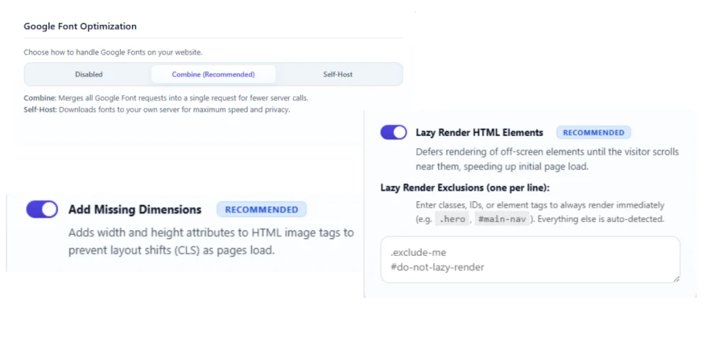
- Automated Media Dimension Injection: OptiWave scans your rendered HTML in real time and automatically injects missing
width,height, andaspect-ratioattributes onto images, SVGs, and responsive iframes before delivery. - 1-Click Google Font Localizer with Fallback Matching: OptiWave self-hosts Google Fonts locally, converts them to modern WOFF2 formats, and calculates exact CSS
size-adjustmetric overrides for local system fallbacks to eradicate font swap shifts. - Dynamic Container Geometry Reservation: Automatically tags dynamic slots with unique IDs (
data-ow-uid) and enforces minimum height containers so banners and third-party widgets never disrupt content flow. - Full Core Web Vitals Optimization: Seamlessly pairs layout stabilization with ultra-low server latency. If your TTFB is slow, read our breakdown on how to reduce initial server response time in WordPress, our guide to optimize Largest Contentful Paint, and our actionable tutorial to fix Interaction to Next Paint in WordPress.
What is a good CLS score according to Google?
Under Google Core Web Vitals criteria, a Good Cumulative Layout Shift (CLS) score is 0.1 or less for at least 75% of page visits across mobile and desktop devices. A CLS score between 0.1 and 0.25 Needs Improvement, while anything exceeding 0.25 is rated as Poor. For frictionless user experience and high conversion rates, our production target across WordPress builds is a true 0.00 CLS score.
Why do web fonts cause layout shifts?
Web fonts cause layout shifts during font swapping (Flash of Unstyled Text or FOUT). When the browser renders text using a local system fallback font and then swaps to the remote web font, differences in x-height, glyph widths, and ascent metrics cause headings and paragraphs to change dimensions. This re-flows all surrounding content downward. Applying CSS font metric overrides (size-adjust, ascent-override, and descent-override) matches fallback dimensions to eliminate swap shifts.
How do missing image dimensions cause CLS?
When an image tag lacks explicit width and height attributes or CSS aspect-ratio properties, the browser assigns it zero vertical height during initial HTML tokenization. Once the image file downloads over the network, the browser recalculates page geometry and suddenly expands the image container. This violently pushes all content below it downward, triggering a heavy layout shift penalty.
Does content-visibility: auto cause layout shifts?
Yes, if configured without contain-intrinsic-size. The CSS content-visibility: auto property skips layout rendering for offscreen elements to conserve CPU cycles. However, if you omit a matching contain-intrinsic-size rule, the browser treats offscreen blocks as 0px tall. When the user scrolls near those blocks, they suddenly expand, causing severe scrollbar jumps and layout reflows.
How does lazy loading affect Cumulative Layout Shift?
Native lazy loading does not cause layout shifts if the container or image has explicit dimensions declared in the HTML. But if lazy-loaded images lack width and height attributes, the browser cannot reserve the required layout slot before the image enters the viewport. When the image triggers loading during scrolling, it expands dynamically and produces layout shifts.