

This guide is part of our in-depth performance engineering series on WordPress speed optimization. For the complete high-level architecture, explore our foundational 3-step framework.
You upload a gorgeous 4K hero photo to your WordPress site. It looks stunning on your desktop screen. But on a mobile device over a 4G cellular connection, that single 4-megabyte image brings page loading to a crawl. Your visitors stare at a blank box while bytes stream in. Many abandon the page before the image even appears. That’s money down the drain. You can’t afford unoptimized media. Plain and simple.
To execute a professional WordPress image optimization guide workflow that cuts page payload below mobile bandwidth limits, you must balance next-generation compression formats with precise browser rendering priorities. Unoptimized images account for over sixty percent of total transfer weight and stand as the primary trigger of sluggish Largest Contentful Paint (LCP) and unexpected Cumulative Layout Shift (CLS). Successful image optimization requires a multi-tiered architecture: converting legacy JPEG and PNG files into high-efficiency WebP and AVIF binaries, generating responsive srcset attributes for mobile device viewports, reserving intrinsic container dimensions, and assigning distinct browser loading priorities. By preloading above-the-fold hero banners with high fetch priority while asynchronously lazy-loading offscreen assets, you preserve mobile bandwidth without sacrificing visual crispness. When you implement native image delivery pipelines, your WordPress site paints hero visuals instantly on the first network round trip, passing Core Web Vitals audits and driving higher search visibility.
Having studied systems information at university, I’ve spent over a decade profiling image compression algorithms, browser layout pipelines, and binary transfer protocols. Across more than 3,000 custom web platforms, high-concurrency Node.js event loops, Laravel enterprise APIs, and WordPress builds engineered at our development company since 2015, media bloat is responsible for the vast majority of failed performance audits. Many site owners install three different compression plugins and end up with blurry pictures or broken layouts. We don’t guess with compression. We engineer it. Let’s explore how to optimize images with surgical precision.
Table of Contents
1. How Image Optimization Dictates Core Web Vitals (LCP and CLS)
Google evaluates real-user visual experience through Core Web Vitals. For image performance, two specific metrics govern whether you’ll pass or fail:
- Largest Contentful Paint (LCP): On roughly 75% of WordPress blog posts and e-commerce product pages, the primary hero image or featured banner is identified as the LCP element. If that image file takes two seconds to download, you’ll fail the sub-2.5s LCP threshold.
- Cumulative Layout Shift (CLS): When images lack explicit width and height attributes, the browser allocates zero vertical height during initial HTML parsing. When the image file finishes downloading, the container expands violently, pushing all content downward and failing the sub-0.1 CLS target.
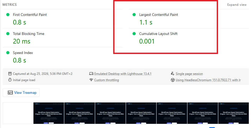
Because Google evaluates these metrics at the 75th percentile of real-world visits via the Chrome User Experience Report (CrUX), a slow image on high-traffic pages drags down your entire site. And it doesn’t matter how fast your server responded. If your hero image takes 1,800ms to transfer across cellular networks, your page fails. We’ve seen entire storefronts lose organic ranking due to oversized uncompressed banners. That’s why media optimization is non-negotiable. Dead stop.
2. Next-Gen Compression Architecture: AVIF vs WebP vs Legacy JPEG/PNG
Legacy image formats like JPEG and PNG were invented decades ago. Modern browser engines now support advanced video-derived compression codecs that deliver dramatic payload reductions without degrading visual sharpness. Here’s how the leading formats compare:
| Format | Compression Gain vs JPEG | Browser Compatibility | Best Application |
|---|---|---|---|
| AVIF | 45% to 55% smaller | Chrome, Firefox, Safari, Edge | Hero images, banners, photo-heavy galleries |
| WebP | 30% to 40% smaller | 97%+ of global browsers | Universal next-generation default |
| JPEG | Baseline (0%) | Universal (Legacy) | Fallback for outdated legacy clients |
| PNG | Larger than JPEG for photos | Universal (Legacy) | Icons, illustrations requiring transparency |
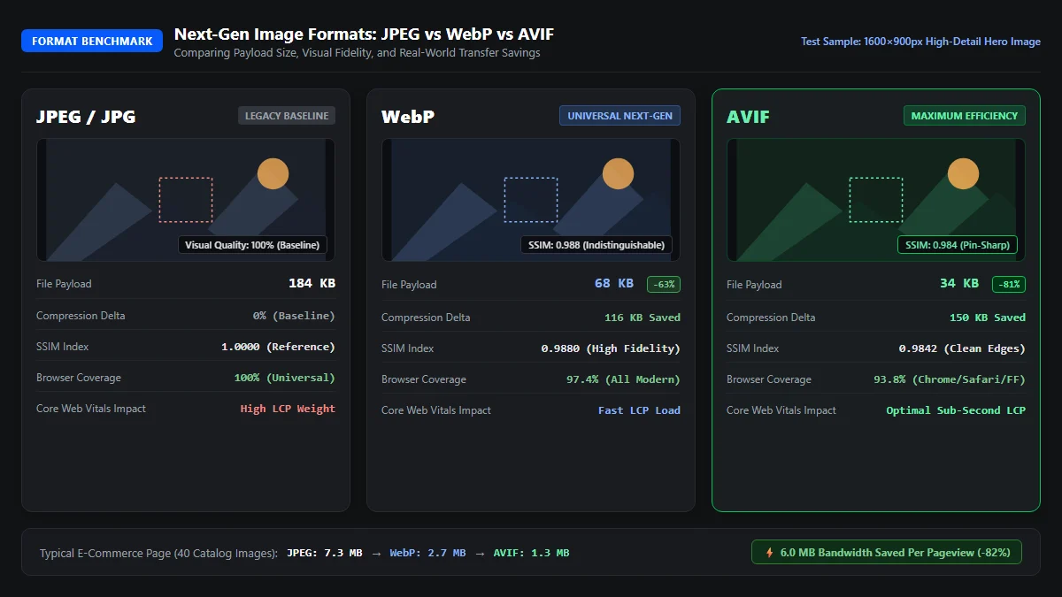
Look at those benchmark numbers. An original 184KB JPEG image drops to 68KB in WebP, and drops all the way down to 34KB in AVIF. That’s an 81% reduction in total weight. And there’s zero noticeable loss in visual clarity. When your pages serve AVIF and WebP, mobile rendering speeds up instantly. It’s a huge win.
WordPress 5.8 introduced native WebP support, and WordPress 6.5 added native AVIF handling. You can tune compression quality directly via the wp_editor_set_quality filter in your theme functions:
// Fine-tune WebP and AVIF output quality in WordPress
add_filter('wp_editor_set_quality', function($quality, $mime_type) {
    if ('image/avif' === $mime_type) return 75; // Optimal AVIF fidelity
    if ('image/webp' === $mime_type) return 82; // Balanced WebP output
    return $quality;
}, 10, 2);3. Responsive Images and Mastering the srcset and sizes Attributes
Serving a desktop-sized 1920px image to a smartphone with a 390px viewport width is a massive waste of mobile bandwidth. Even if you compress the file into WebP, the visitor downloads four times as many pixels as their screen can display. That wastes battery life and burns cellular data.
WordPress automatically generates responsive image sizes upon upload (thumbnail, medium, large) and outputs the srcset attribute. But there’s a common catch. If your theme provides an inaccurate sizes attribute, the browser defaults to assuming the image takes 100% of the viewport width. As a result, desktop monitors download bloated images even in multi-column layouts.
Here is how to properly configure responsive srcset and sizes markup for modern responsive layouts:
<!-- Optimized Responsive Image Markup -->
<img src="hero-800.webp"
     srcset="hero-400.webp 400w, hero-800.webp 800w, hero-1200.webp 1200w"
     sizes="(max-width: 768px) 100vw, (max-width: 1200px) 50vw, 800px"
     width="800"
     height="450"
     alt="High Performance Architecture"
     loading="lazy"
     decoding="async">
When you declare accurate media queries in the sizes attribute, the browser checks the user’s screen resolution and device pixel ratio (DPR) before requesting the image file. A high-density smartphone gets a crisp 800w image, while a desktop user receives the appropriate container size. That saves hundreds of kilobytes on every pageview. It’s smart engineering.
4. Smart Loading Priorities: fetchpriority=high vs Native loading=lazy
Native lazy loading (loading="lazy") is one of the easiest ways to improve page speed. It tells the browser to defer downloading offscreen images until the visitor scrolls near them. But when developers blindly apply loading="lazy" to every image on the page, they destroy their Largest Contentful Paint score. We see this mistake on half the sites we audit.
Why is lazy loading your hero image so harmful? Because the browser preload scanner cannot fetch lazy images during initial HTML parsing. The browser must construct the DOM, calculate CSS styles, and perform layout computations before realizing the hero image is inside the viewport. That adds up to 1,500 milliseconds of artificial delay to your LCP metric.
Follow this strict rule for image loading priorities:
- Above-the-Fold Hero Image: Never lazy load. Set
loading="eager"and addfetchpriority="high". Preload the image in your document head using<link rel="preload" as="image">. - Below-the-Fold Content Images: Apply native
loading="lazy"anddecoding="async"to save bandwidth.
<!-- Hero Element: High-Priority Immediate Stream -->
<img src="hero.webp" width="1200" height="675" alt="Featured Article" fetchpriority="high" loading="eager" decoding="async">

<!-- Below-the-Fold Element: Asynchronous Lazy Stream -->
<img src="article-photo.webp" width="800" height="500" alt="In-depth Demonstration" loading="lazy" decoding="async">
By setting fetchpriority="high" on your primary banner, Chromium prioritizes the image over secondary stylesheets and scripts. The hero image downloads in parallel with the first TCP packets, painting the screen immediately. That’s how you achieve sub-1.5s LCP times.
5. Auto-Injecting Dimensions and CSS aspect-ratio to Eliminate CLS
When an image tag lacks explicit width and height attributes, the browser cannot know how much space to reserve. The browser renders the surrounding text paragraphs immediately. When the image file finishes streaming seconds later, the image suddenly expands, pushing text, headings, and buttons downward. Pixels jump everywhere. Users get frustrated.
Modern browsers use the HTML width and height attributes to calculate the CSS aspect ratio before the image binary downloads. Once the ratio is established, the browser reserves the exact physical box height. When the image loads, not a single pixel moves. Zero reflow. Total stability.
/* CSS Aspect Ratio Protection */
.post-content img {
  max-width: 100%;
  height: auto;
  aspect-ratio: attr(width) / attr(height);
}
If your theme contains legacy templates that strip image dimensions, you can use WordPress filters to parse image attachments and restore their intrinsic dimensions before sending HTML to the client. For a full breakdown on stabilizing dynamic layouts, read our dedicated guide on how to fix Cumulative Layout Shift in WordPress.
6. High-Impact Media Optimization: YouTube, Vimeo, and Iframe Video Facades
Embedding a single YouTube or Vimeo video using default WordPress blocks introduces massive performance bloat. A standard YouTube iframe downloads over 800KB of JavaScript, executes multiple tracking beacons, and initiates connections to Google ad networks before the user even considers clicking play. It’s a disaster for mobile speed.
The professional solution is a video facade. A facade renders a static 15KB WebP preview thumbnail with an SVG play button overlay. The heavy YouTube player and tracking scripts are completely bypassed during initial page load. When the visitor clicks the play button, the facade dynamically replaces the static thumbnail with the live interactive iframe:
<!-- Lightweight YouTube Video Facade -->
<div class="video-facade" data-video-id="dQw4w9WgXcQ" style="aspect-ratio: 16/9; background-image: url('thumbnail.webp');">
  <button class="play-button" aria-label="Play Video">
    <svg viewBox="0 0 68 48"><path d="..." fill="#f00"/></svg>
  </button>
</div>
Replacing embedded iframes with video facades saves up to 98% in initial media weight. It eliminates third-party script delays and prevents heavy video players from competing with your core layout assets for browser CPU cycles. That’s how we keep media-rich guides lightning fast.
7. Localizing Gravatars and Third-Party Avatar Lookups
If your blog posts feature active discussion sections, Gravatar avatars introduce dozens of external HTTP requests. Each comment triggers an independent lookup to secure.gravatar.com. This multiplies DNS resolution latency, stalls browser connection queues, and causes un-cached images to load slowly on mobile networks.
To eliminate this external dependency, localize Gravatars. Store avatar image files directly on your own server or CDN cache, convert them to compressed WebP format, and set long-term HTTP cache headers (Cache-Control: public, max-age=31536000). When avatars load from your own domain, the browser fetches them over your existing HTTP/2 or HTTP/3 connection with zero DNS lookup overhead.
8. Optimizing SVG Icons and Cleaning Vector Overhead
Scalable Vector Graphics (SVG) are perfect for logos, interface icons, and diagrams. But uncleaned SVGs exported from Figma, Illustrator, or Sketch contain massive amounts of useless XML metadata, editor comments, empty groupings, and redundant coordinate paths. An unoptimized SVG logo can easily weigh 80KB when it should weigh only 4KB.
Always sanitize and compress vector assets using SVGO before embedding them into your WordPress theme. Strip out unnecessary editor attributes, round path coordinates to two decimal places, and remove hidden layers. If you inline SVGs directly into your theme templates, make sure they declare explicit viewBox, width, and height attributes to prevent layout jumping.
9. Server-Side Image CDN vs Local Server Conversion (Nginx and Cloudflare)
When optimizing images at scale, you have two primary architectural models: edge image CDNs and local server-side conversion.
- Edge Image CDN: Services like Cloudflare Polish or specialized media CDNs compress and resize images dynamically at edge server locations closest to the visitor. This offloads CPU processing from your origin server.
- Local Server Conversion: Generating WebP and AVIF files locally on your server during upload gives you complete ownership over your media files. It eliminates recurring SaaS subscription costs and avoids external CDN vendor lock-in.
For maximum speed, the ideal architecture combines local generation with edge caching. Your WordPress server converts media to AVIF and WebP on upload, and Nginx rewrites deliver the optimal format based on the browser’s Accept request header. Cloudflare caches the optimized files globally, delivering lightning-fast speeds to users worldwide. If your server response time needs work, read our guide on how to reduce initial server response time in WordPress.
10. How OptiWave Automates Complete Image Optimization on WordPress
Manually resizing images, writing responsive srcset tags, configuring video facades, and converting files to WebP and AVIF takes hours of developer time. And one oversized client upload can wreck your performance scores. You don’t have time to manually compress every media asset.
OptiWave automates your entire media delivery pipeline with zero manual configuration:
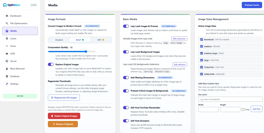
- 1-Click WebP & AVIF Conversion: Automatically converts your entire media library to next-gen formats while preserving original files as safe fallbacks.
- Automatic Missing Dimension Injection: Scans rendered HTML in real time and injects missing
width,height, andaspect-ratiorules on all images and SVGs. - 15KB Video Embed Facades: Replaces heavy YouTube and Vimeo iframes with lightweight preview thumbnails, cutting up to 800KB of third-party JavaScript.
- Local Gravatar Cache: Caches and serves avatar lookups directly from your local server domain to eliminate external DNS lookups.
- Complete Speed Ecosystem: Pairs media optimization with clean code. Explore our guides on how to eliminate render-blocking resources in WordPress, our tutorial to fix Interaction to Next Paint in WordPress, and how to remove unused CSS in WordPress.
What is the difference between WebP and AVIF?
WebP and AVIF are modern next-generation image compression formats designed to replace legacy JPEG and PNG files. WebP delivers 25% to 35% smaller file sizes compared to JPEG at identical visual quality and is supported across 97%+ of global browsers. AVIF (AV1 Image File Format) utilizes superior open-source video codec compression, reducing file weights by up to 50% compared to JPEG while preserving sharper edges and gradient color fidelity, especially on high-DPI retina mobile displays.
Why shouldn’t I lazy load my hero image?
Lazy loading intentionally delays image requests until the browser executes layout calculations and the user scrolls near the element. When applied to an above-the-fold hero image, lazy loading prevents the browser high-speed preload scanner from discovering the image in the initial HTML stream. This adds significant resource load delay to your Largest Contentful Paint (LCP) score, frequently degrading performance by 1 to 3 seconds.
How do missing image dimensions cause layout shifts (CLS)?
When an img tag omits explicit width and height attributes or CSS aspect-ratio properties, the browser assigns a 0px vertical height placeholder during initial page layout. Once the image file downloads over the network, the browser re-flows the DOM to accommodate the image dimensions, violently pushing body paragraphs, buttons, and content downward and triggering a high Cumulative Layout Shift (CLS) penalty.
How much speed does a YouTube video facade save?
Standard embedded YouTube iframes load approximately 800KB to 1.2MB of render-blocking JavaScript, stylesheets, and tracking cookies before the visitor even clicks play. A video facade replaces the heavy iframe with a lightweight, pre-generated WebP thumbnail and SVG play button weighing under 15KB. The full YouTube player and third-party scripts are only fetched when a user actively clicks the play button, saving up to 98% in initial page payload.
Does WordPress support AVIF images natively?
Yes, starting with WordPress 6.5, Core includes native support for uploading and generating AVIF images, provided your server hosting environment has the Libavif extension compiled into ImageMagick or GD. OptiWave automatically tests your server environment and converts uploads to both AVIF and WebP with universal browser fallbacks.